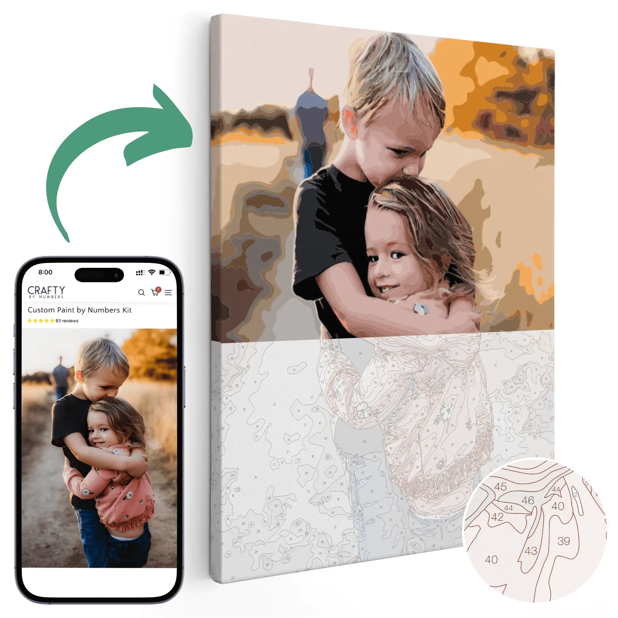
Crafty by Numbers is committed to providing an enjoyable, empowering paint by numbers experience for all, enabling individuals to unwind, connect with their creative side, and produce breathtaking works of art. An important aspect of mastering the art of paint by numbers is understanding color theory—the study of hues, color relationships, and the influential role they play in crafting visually striking compositions. By delving into the world of color theory, even paint by numbers enthusiasts can tap into its potential, transforming their creations from ordinary to extraordinary.

Start your color theory by color painting the Paris Travel Poster kit as a perfect starter project.
Color theory encompasses the science and art of using color, which has a significant impact on how your artwork is perceived and experienced by viewers. Grasping the basics of color theory can elevate your paint by numbers experience, providing valuable insights into the following:
- Harmonious Color Combinations: Discover the importance of selecting hues that work well together, creating a visually pleasing and balanced piece.
- Color Contrast: Learn how to create depth and dimension in your artwork by effectively using contrasting colors.
- Color Psychology: Uncover the emotional and psychological effects of various colors, and how they can set the tone for your masterpiece.
Ready to unlock the secrets of color theory and elevate your paint by numbers experience? Dive into our comprehensive guide and enhance your artistic prowess with our premium paint by numbers kits at Crafty by Numbers today!
The Color Wheel: A Guide to Understanding Hue Relationships
At the heart of color theory lies the color wheel, a simple yet powerful tool that illustrates the relationship between hues. The color wheel is divided into three categories:
- Primary Colors: Red, blue, and yellow are the building blocks of all other colors and cannot be created through color mixing.
- Secondary Colors: When primary colors are combined in equal parts, green (blue + yellow), orange (red + yellow), and violet (red + blue) are formed.
- Tertiary Colors: Mixing a primary color with an adjacent secondary color creates six tertiary colors, such as red-violet and yellow-green.
Understanding the relationships and interactions between these hues on the color wheel will enable you to create balanced and harmonious paint by numbers compositions.

Exploring Color Schemes: Striking the Perfect Balance
Color schemes are organized groupings of colors derived from the color wheel that work well together visually. Implementing thoughtful color schemes in your paint by numbers projects can enhance the final result. Some popular color schemes include the following:
- Monochromatic: This scheme uses a single hue in varying shades, tints, and tones, creating a cohesive and soothing effect. To achieve this look, simply utilize lighter or darker variations of a single color.
- Analogous: Utilizing colors that are adjacent to each other on the color wheel, analogous schemes offer a harmonious blending of hues. For example, combining yellow, yellow-orange, and orange creates a warm, visually pleasing effect.
- Complementary: Colors directly opposite each other on the wheel, such as red and green or blue and orange, create a striking contrast when used in tandem. This scheme adds depth and visual interest to your paint by numbers piece.
- Triadic: This scheme employs three colors evenly spaced around the color wheel, such as red, yellow, and blue, to create a balanced, vibrant effect. Triadic schemes work best when one color is dominant and the others serve as accents.
Experimenting with different color schemes can have a profound impact on your paint by numbers experience, ensuring your creations exude balance and harmony.
Mastering Color Contrast and Depth: Bring Your Artwork to Life
Integrating color contrast and depth into your paint by numbers projects can add incredible visual interest and dimension. Consider these techniques:
- Value Contrast: Create depth by using light and dark colors side by side, such as a dark blue sky against a vibrant, illuminated horizon.
- Saturation Contrast: Experiment with using both bold, highly saturated colors and more muted, subdued hues to create a dynamic visual contrast in your artwork.
- Temperature Contrast: Juxtapose warm colors (red, orange, yellow) with cool colors (blue, green, violet) to add depth and enhance the overall vitality of your paint by numbers piece.
Employing color contrast and depth in your work will elevate your art, making it more eye-catching, dynamic, and memorable.
Delving into Color Psychology: Evoke Emotion with Your Art
Colors have the power to influence emotions, and understanding color psychology can help you create more evocative and captivating paint by numbers projects. Common color associations include the following:
- Red: Passion, excitement, and energy.
- Yellow: Happiness, warmth, and optimism.
- Blue: Calm, trust, and stability.
- Green: Nature, growth, and tranquility.
- Purple: Royalty, mystery, and sophistication.
- Orange: Enthusiasm, creativity, and friendliness.
Select colors for your paint by numbers composition that evoke the desired emotional response or mood, imbuing your artwork with added depth and meaning.
Conclusion
By mastering the basics of color theory, you will unlock the full potential of your paint by numbers creations. Embrace the captivating world of color as you explore various color schemes, learn about hue relationships, and develop techniques for adding depth and contrast. Combining this knowledge with an understanding of color psychology will ensure your paint by numbers masterpieces truly come to life, reflecting your unique artistic vision and style.
Take your paint by numbers adventure to new heights with our exquisite, top-tier paint by numbers kits at Crafty by Numbers and awaken your inner Picasso today!


