

Yes: most people with color vision deficiency can finish and enjoy paint by numbers with a few simple adjustments. The numbered system already does most of the hard work for you, since it replaces color-matching guesswork with a map you can follow by number instead of by eye.
Start with these four moves before you pick up a brush:
- Choose a kit with fewer colors and large, clearly separated sections.
- Label each paint pot with its number in permanent marker, not just relying on the printed cap.
- Work under a neutral, high-CRI light source instead of a dim lamp or colored bulb.
- Preview the design with a colorblindness simulator so you know which shades might blur together.
Color vision deficiency isn’t rare. It affects about 1 in 12 men and 1 in 250 women, mostly in red-green forms. That’s a lot of hobbyists navigating the same craft aisle you are, and the workaround is simpler than most people expect.
Key Takeaways
Paint by numbers works for color vision deficiency because the numbered system replaces hue judgment with a matching task, and small setup changes close the remaining gap.
| Point | Details |
|---|---|
| Adaptations make it accessible | Labeling paints, using neutral lighting, and previewing with a simulator solve most color confusion issues before they happen. |
| Value matters more than hue | Sorting paints by brightness first gives a reliable visual anchor when hue is hard to judge. |
| Kit choice changes difficulty | Fewer colors, larger sections, and strong light/dark contrast make a kit noticeably easier to complete. |
| Simulators and generators help in different ways | Simulators preview confusion risk; palette generators like Tembrica’s build sets that stay distinguishable from the start. |
| Craftybynumbers offers accessible options | Custom kits, multiple sizes, and high-contrast designs like Garden of Dreams give colorblind painters practical starting points. |
Table of Contents
- Why Paint by Numbers Works Well for Colorblind Painters
- Step-by-Step Tips for Painting With Color Vision Deficiency
- Tools and Adaptations That Make a Real Difference
- How to Choose an Accessible Paint-by-Numbers Kit
- How Crafty By Numbers Supports Accessible Painting
- Picking the Right Photo or Canvas for Easier Painting
- What Actually Moves the Needle for Colorblind Painters
- Start Your Next Kit With Accessibility Built In
- Sources
- FAQ
Why Paint by Numbers Works Well for Colorblind Painters
The whole appeal of paint by numbers is that it takes hue judgment off the table. You’re not standing in front of a blank canvas trying to decide if this green reads as “sage” or “olive.” You’re matching a number on a paint pot to a number on the canvas. That single design choice is why the format has become such a natural fit for anyone with color vision deficiency.
A standard kit gives you three things: a numbered canvas, a set of pre-matched acrylic paints, and detail brushes. Every color decision has already been made for you before the box ships. That’s a meaningful shift for someone with red-green deficiency, since it swaps out the hardest part of painting (choosing and mixing color) for the easiest part (matching numbers).
There’s a real physiological reason this matters. Most forms of color vision deficiency affect hue perception, not brightness perception. You can usually tell light from dark just fine even if you can’t reliably separate red from green. So a system built around numbers rather than color names sidesteps the exact skill that’s compromised, while leaning on the one that isn’t.
A few things make the format especially forgiving:
- Numbered regions remove the need to identify a color by sight before applying it.
- Pre-mixed paints eliminate the risk of blending the wrong two shades together.
- Reference guides use a fixed key, so you’re never relying on memory for what “color 14” looks like.
Step-by-Step Tips for Painting With Color Vision Deficiency
Getting a smooth session with fewer corrections comes down to setup more than skill. Here’s a workflow that removes most of the guesswork before you even open the paint pots.
- Label every pot the moment you open the box. Don’t trust the tiny printed number on the cap. Write the number again on the side in bold marker, or add a colored sticker that matches a code you control.
- Sort your paints by value before you sort by anything else. Group the darkest tones together, then the mid-tones, then the lightest. Because luminance cues tend to survive color vision deficiency better than hue cues, sorting by lightness gives you a reliable visual anchor even when two colors look nearly identical.
- Paint the largest sections first. Big shapes are more forgiving of small color mismatches and let you build confidence before tackling detail work.
- Set up under a neutral, high-CRI lamp. A warm yellow bulb or a cool blue-toned LED can shift how paint colors read on the canvas. A daylight-balanced bulb (around 5000K) keeps colors as true to their intended shade as your eyes can manage.
- Switch to a magnifier or a fine detail brush for tiny numbered sections. Squinting at a section smaller than a pencil eraser is where most mistakes happen, colorblind or not.
- Take breaks every 30 to 45 minutes. Eye fatigue makes color discrimination worse for everyone, and it compounds fast if you’re already working harder to separate similar tones.
Pro Tip: If two paint numbers look suspiciously close, dab a small test swatch of each onto a scrap corner of paper before committing to the canvas. Side-by-side on paper, subtle differences in brightness or saturation often become obvious that weren’t visible straight from the pot.
If you want more general technique guidance beyond color handling, Craftybynumbers has a beginner’s guide to painting small details that pairs well with the steps above.
Tools and Adaptations That Make a Real Difference
A handful of tools can catch problems before they end up on your canvas instead of after. None of them require special equipment beyond a smartphone or a free web tool.
Colorblindness simulators let you preview how a kit’s palette will actually look to your eyes, or to a specific type of deficiency like deuteranopia. One artist’s account of using a simulator to approximate her partner’s color vision shows how effective this can be: she ran a palette through the simulator, identified which shades collapsed into each other, and labeled the physical paint tray accordingly before ever picking up a brush.
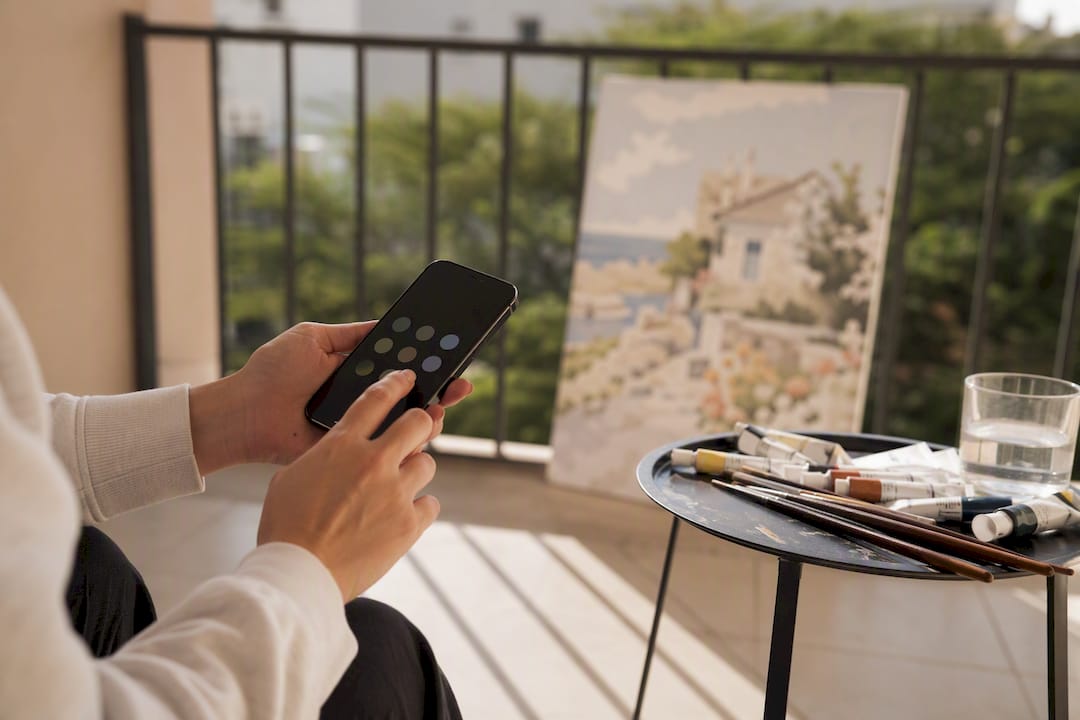
Palette generators go a step further by building color sets that stay distinguishable even under simulated color vision deficiency. Tools built on the OKLCH color space with Delta-E thresholds test every pair of colors in a palette to confirm they’re perceptually separated enough to tell apart, which is the same logic that makes a well-designed kit easier to paint than a poorly designed one.
Beyond software, a few low-tech fixes go a long way:
- Washable marker codes or small tactile stickers on paint pot lids for quick identification by touch.
- Sorting trays that group paints by number range instead of leaving them loose in the box.
- A magnifier lamp that combines light and zoom for the smallest numbered sections.
- Color-correcting glasses, which help some people with red-green deficiency but don’t work for everyone and aren’t a substitute for good labeling.
Color vision deficiency affects about 1 in 12 men, so it’s worth treating these tools as standard practice rather than a niche workaround.
How to Choose an Accessible Paint-by-Numbers Kit
Not every kit is equally friendly to color vision deficiency, and you can usually tell within a few seconds of looking at a product photo. A kit with 40 tightly clustered pastel shades is going to be harder than one with 18 colors and clear light-to-dark contrast.
Look for large sections rather than tiny fragmented ones, since bigger shapes give you more room to confirm placement against the reference guide before committing. A design with strong contrast between light and dark areas, like Blossoming Cottage, is generally easier to follow than a kit built on subtle mid-tone variation. If you’d rather control the palette from the start, a custom kit made from your own photo lets you choose a source image with naturally high contrast, which simplifies the color-matching job before the kit is even printed.
Here’s a quick way to size up any kit on a product page:
| Feature to Check | What to Look For |
|---|---|
| Color count | Fewer colors is generally easier to manage |
| Section size | Larger, simpler shapes reduce the risk of misplaced paint |
| Contrast level | Strong light/dark separation beats subtle tonal shifts |
| Included extras | Labeled reference guide, sorted brushes, clear numbering |
| Customization | Option to submit your own high-contrast photo |
- Skip kits where the marketing photos show dozens of near-identical pastel shades packed into a small canvas.
- Favor kits that list their color count on the product page. If it’s not listed, that’s worth asking about before buying.
How Crafty By Numbers Supports Accessible Painting
Every kit ships with the same core promise: a pre-printed numbered canvas, matched acrylic paints, and detail brushes, so the color-identification work is done before the box arrives. That structure is exactly what makes the format workable for color vision deficiency in the first place, and Craftybynumbers has built its whole catalog around it.
The kits that work best for color vision deficiency aren’t the ones with the flashiest palette. They’re the ones where the number system is impossible to misread and every pot is easy to tell apart at a glance.
Beyond the standard format, a few specific product choices make accessibility easier to act on:
- The Multi-Size Custom Paint by Numbers Kit lets you scale up to a bigger canvas, which means bigger sections and less squinting.
- Custom Paint by Numbers turns your own photo into a kit, so you can start from an image with strong natural contrast.
- Craftybynumbers has served more than 120,000 customers, a base that includes plenty of painters who’ve worked around color vision deficiency using exactly the labeling and lighting tricks covered above.
Paula S., who has spent time advising colorblind painters on kit selection, notes that the biggest wins come from setup, not talent: get the labeling and lighting right, and the painting itself takes care of itself.
Picking the Right Photo or Canvas for Easier Painting
The image a kit is built from matters as much as the paint set itself. A photo with soft, similar tones throughout, think a sunset with a dozen shades of orange, is genuinely hard work for anyone with red-green deficiency, because the numbered sections will be closer in perceived brightness even though they’re mapped to different paint numbers.
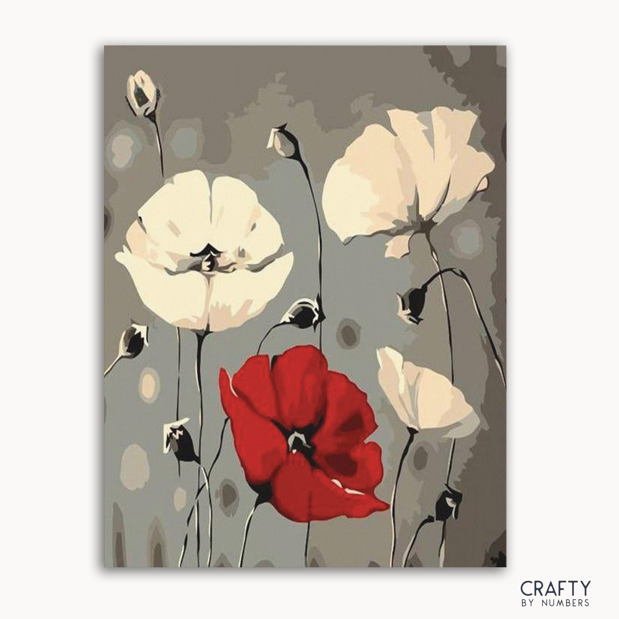
Look instead for source images with clear structural contrast: a dark subject against a light background, a garden scene with strong greens against pale stone, or architecture with crisp shadow lines. Garden of Dreams is a good example of a design where foliage, structure, and background separate cleanly by value, not just by hue. A busy floral piece like Gentle Sakura works well specifically because the blossoms sit at a different brightness level than the background, so the shapes stay readable even if two petal shades are hard to tell apart by color alone.
If you’re commissioning a custom kit, pick a photo where the subject is clearly separated from its background in brightness, not just color. A dog with dark fur against a light wall converts far more reliably than a dog with medium brown fur against a similarly toned floor. Architecture and cityscapes, like a custom version of a Colorful World Map, often translate well too, since borders and landmasses create natural contrast lines regardless of the color palette layered on top. A design like Colorful Doorways also leans on bold, high-saturation blocks of color that stay distinct even under simulated color vision deficiency, which is worth keeping in mind if you’re choosing between two similarly styled kits.
What Actually Moves the Needle for Colorblind Painters
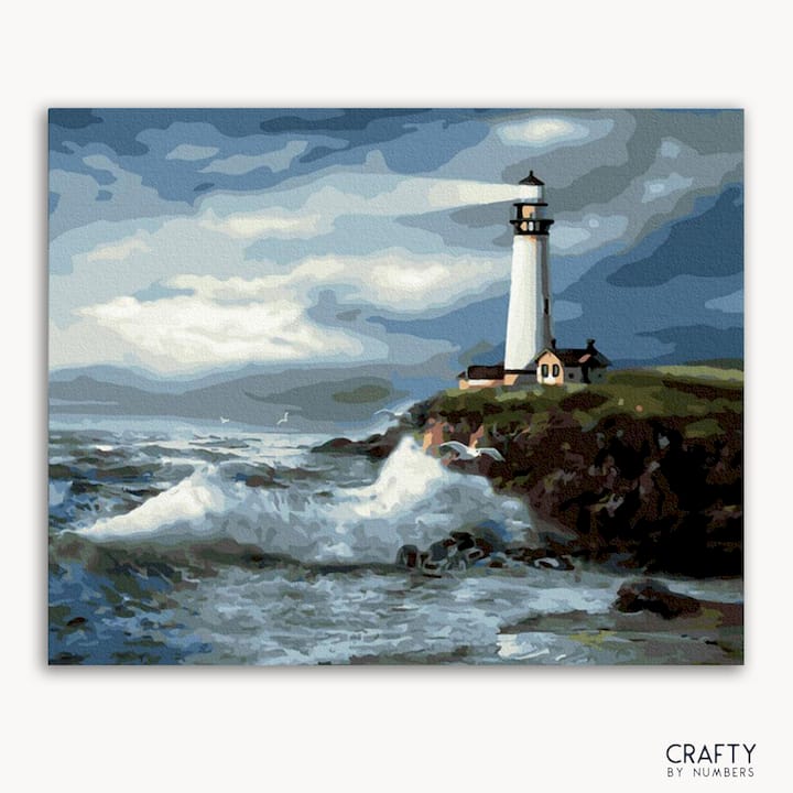
The advice you’ll find most often, “just pick bright colors,” misses the actual mechanism. Bright doesn’t mean distinguishable. Two colors can both be vivid and still collapse into the same perceived shade under red-green deficiency. What matters is contrast in value and saturation between adjacent numbered sections, not how bold any single color looks on its own.
That’s where a lot of general painting advice falls short for this audience. It treats color vision deficiency as a minor inconvenience to work around with willpower, when it’s really a design problem that gets solved before the brush touches canvas. The kit’s structure, the lighting in the room, and the labeling on the pots do more work than any amount of squinting or guessing ever will.
If there’s one priority above the rest, it’s labeling. Not the lamp, not the simulator, not even the kit choice. A pot mislabeled or unlabeled undoes every other precaution you’ve taken. Get that right first, then layer in better lighting and a simulator check, and most of the frustration people associate with this hobby simply doesn’t materialize.
— Paula S.
Start Your Next Kit With Accessibility Built In
Craftybynumbers designs every kit around the same principle that makes paint by numbers work for color vision deficiency in the first place: clear numbering, matched paints, and reference guides that remove the guesswork before you start. Unlike generic art supplies where you’re left mixing and matching shades on instinct, each kit arrives with the color decisions already made, so the only thing standing between you and a finished piece is following the numbers.
If you’re new to the format, the Ivory Essence kit is a strong starting point thanks to its clean contrast and manageable section sizes. Want more control over the source image? Submit your own photo through the Custom Paint by Numbers option and pick an image with the kind of light-to-dark separation that makes painting easier on the eyes. Pair either kit with the Premium Paint Brushes set for finer control on small numbered sections. Browse the current collection and pick the design that fits your skill level and your eyes.
Sources
A few resources are worth bookmarking if you want to test your own perception or fine-tune a palette before your next kit arrives.
- Written evidence on color vision deficiency (UK Parliament)
- Painting the Palette of a Color Blind Artist — Emily Wick
FAQ
Can People With Color Blindness Do Paint by Numbers?
Yes. The numbered system replaces color identification with number matching, so most people with color vision deficiency can complete kits successfully, especially with clear labeling and good lighting.
What Does It Mean if I Can’t See Numbers in a Color Blind Test?
Missing numbers in a standard color vision test (like an Ishihara plate) usually indicates red-green color vision deficiency, the most common form, which affects roughly 1 in 12 men and 1 in 250 women.
What Are Good Paint by Numbers Kits for Visually Impaired People?
Kits with fewer colors, larger sections, and strong contrast work best, such as Blossoming Cottage or a custom kit built from a high-contrast photo.
What Colors Should Be Avoided for Color Blindness?
Avoid palettes with several similar mid-tone reds, greens, or browns clustered close together, since these are hardest to separate under red-green deficiency; high-contrast pairings like blues and pinks tend to stay distinguishable.
Is Color Blindness Part of ADHD?
No. Color vision deficiency and ADHD are separate and unrelated conditions; one affects color perception in the eyes, while the other affects attention and executive function.
0 commentaire