

Capture a high-resolution master image, RAW if your camera allows it, with the sensor parallel to the artwork, even diffuse lighting, and a grey card in the first frame for color reference. Shoot the full piece plus two or three detail crops, then archive the originals before you export anything for the web. That sequence, done consistently, is the entire foundation of accurate photography of finished art for sharing across a portfolio, a gallery submission, or a social feed.
Before you pick up the camera, run through this:
- Tripod, plus a camera or phone capable of shooting RAW
- Two lights or bright indirect daylight, diffused
- Grey card or color checker
- Remote shutter or self-timer to kill camera shake
- Clean artwork surface and a neutral, uncluttered background
If you’re prepping for a museum submission, a highly reflective varnished surface, or large-format print reproduction, this is where hiring a professional photographer with proper studio color fidelity actually pays for itself. For everything else, the DIY workflow below gets you there.
Key Takeaways
Accurate photography of finished art for sharing depends on a color-calibrated master image shot with a parallel camera angle, diffuse lighting, and a preserved high-resolution original.
| Point | Details |
|---|---|
| Shoot a RAW master first | Capture the highest-quality file your camera allows and archive it before any web export. |
| Use a grey card every session | Set white balance from a neutral reference frame so colors match the real artwork. |
| Keep the sensor parallel | Mount on a tripod and align with the artwork’s plane to avoid trapezoid distortion. |
| Fight glare at 45 degrees | Angle lights and camera off-axis, or remove glass entirely, to cut reflections on varnish. |
| Finish with photo-ready gloss | Crafty By Numbers’ Gloss Varnish and Acrylic Medium Gloss Gel affect reflectivity, so test-shoot before finishing a full kit. |
Table of Contents
- Building the Equipment Checklist for Finished Art Photography
- How Should You Light a Finished Painting for Photos?
- Camera Settings and Framing That Prevent Distortion
- Getting the Color to Match: Calibration and White Balance
- Fixing Glare on Varnish, Glass, and Textured Surfaces
- Editing for Accuracy, Not Style
- Naming, Backing Up, and Sharing Files Without Losing Quality
- Photographing Art on Your Phone: A Fast, Reliable Shortcut
- A Working Photographer’s Take on Getting This Right
- Ready to Photograph a Finished Piece Worth Showing Off?
- Tools Worth Bookmarking for Better Artwork Photos
- Sources
- FAQ
Building the Equipment Checklist for Finished Art Photography
You don’t need a studio to get this right. The minimum kit is a tripod, a camera or phone with RAW capability, a diffuser (a white foam board works fine), low ISO performance, and some way to trigger the shutter without touching the camera.
If you photograph artwork often enough to justify an upgrade, add:
- Two daylight-balanced LED panels on stands with diffusion fabric
- A color checker or grey card
- A polarizing filter for glare control
- A prime lens somewhere in the 50mm to 100mm range, which flattens perspective better than a wide zoom
Each piece solves a specific problem. The tripod eliminates blur at slower shutter speeds. The diffuser softens shadow edges. The grey card gives your editing software something neutral to calibrate against. Skip any one of these and you’re compensating for it later in post, usually imperfectly.
Pro Tip: A cheap foam board reflector bounces light back into shadow areas almost as well as a second light source, and it costs a fraction of the price.
How Should You Light a Finished Painting for Photos?
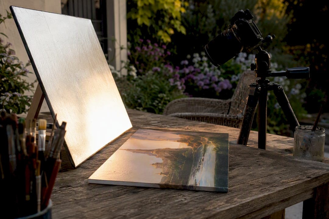
Two lights positioned at 45-degree angles to the artwork, both diffused, is the standard setup professional photographers rely on for even, color-accurate results. If you don’t own studio lights, a north-facing window or bright overcast daylight does the job almost as well, since both produce soft, directionless light without harsh shadows.
- Position both lights (or yourself, relative to the window) at matching 45-degree angles to avoid one side reading brighter than the other.
- Diffuse each source with a softbox, diffusion fabric, or even a bedsheet stretched over a frame.
- Bounce fill light into shadow areas using white foam core positioned opposite your main light.
- Shoot a grey card test frame first and check the histogram before committing to the full shoot.
Watch for color casts, especially if you’re mixing daylight bulbs with warmer household lamps. A two-light 45-degree setup or diffused window light removes hot spots almost entirely when both sources match in temperature. Mismatched bulbs are the single most common reason a photo looks slightly off compared to the real painting.
- Keep both lights at the same color temperature (check the Kelvin rating on the bulb packaging)
- Avoid mixing daylight and tungsten sources in the same shot
- Test with a grey card before shooting the full series
Camera Settings and Framing That Prevent Distortion
Trapezoid distortion, where a rectangular canvas looks skewed in the photo, comes almost entirely from the camera not being parallel to the artwork’s plane. Mount the camera on a tripod, center the piece in frame, and check the edges against your viewfinder grid before you shoot.
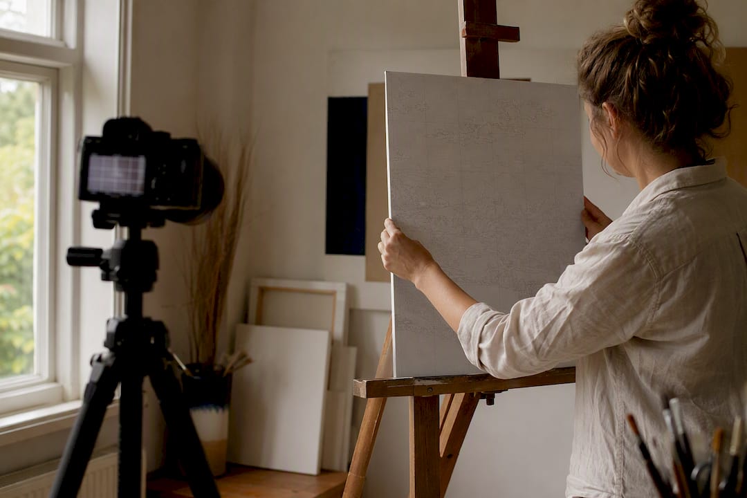
For settings, keep ISO low (100 to 200) to avoid grain, use an aperture around f/8 to f/11 for edge-to-edge sharpness across the full canvas, and let your tripod handle whatever shutter speed the light requires. Shoot RAW if your camera supports it. RAW files hold far more color and exposure data than JPEG, which matters enormously once you start correcting for a slightly warm light source or a shadow you missed.
Your framing sequence should include:
- One full, straight-on shot of the entire piece with margin for cropping
- Two or three detail crops of texture, brushwork, or focal areas
- An angled shot if the surface has visible dimension or impasto texture
Leave breathing room around the edges in every frame. Instagram, a print lab, and a gallery submission portal all want different aspect ratios, and you can’t add back canvas that got cropped out in-camera.
Getting the Color to Match: Calibration and White Balance
A photo that doesn’t match your actual painting is almost always a white balance problem, not a lighting problem. Shoot a grey card or color checker in the first frame of every session, then use that frame to set custom white balance in your RAW editor. Every other image from that session inherits the same correction.
Monitor calibration matters just as much and gets ignored constantly. If your screen runs warm or cool without you knowing it, every color adjustment you make will be wrong in the opposite direction. A $150 hardware calibrator pays for itself the first time you avoid sending a client a print that looks nothing like your edit.
- Shoot the grey card first, every session, no exceptions
- Set white balance from that grey card frame in your RAW editor before touching anything else
- Export sRGB for web sharing, Adobe RGB or ProPhoto RGB for print files
Pro Tip: Keep the grey card in the same lighting as the artwork itself, not off to the side where a shadow might fall across it differently.
Neutral surroundings help too. A colored wall or a nearby fabric backdrop can cast reflected color onto the artwork’s surface, which shows up as an unwanted tint you won’t notice until you’re comparing the photo to the original side by side.
Fixing Glare on Varnish, Glass, and Textured Surfaces
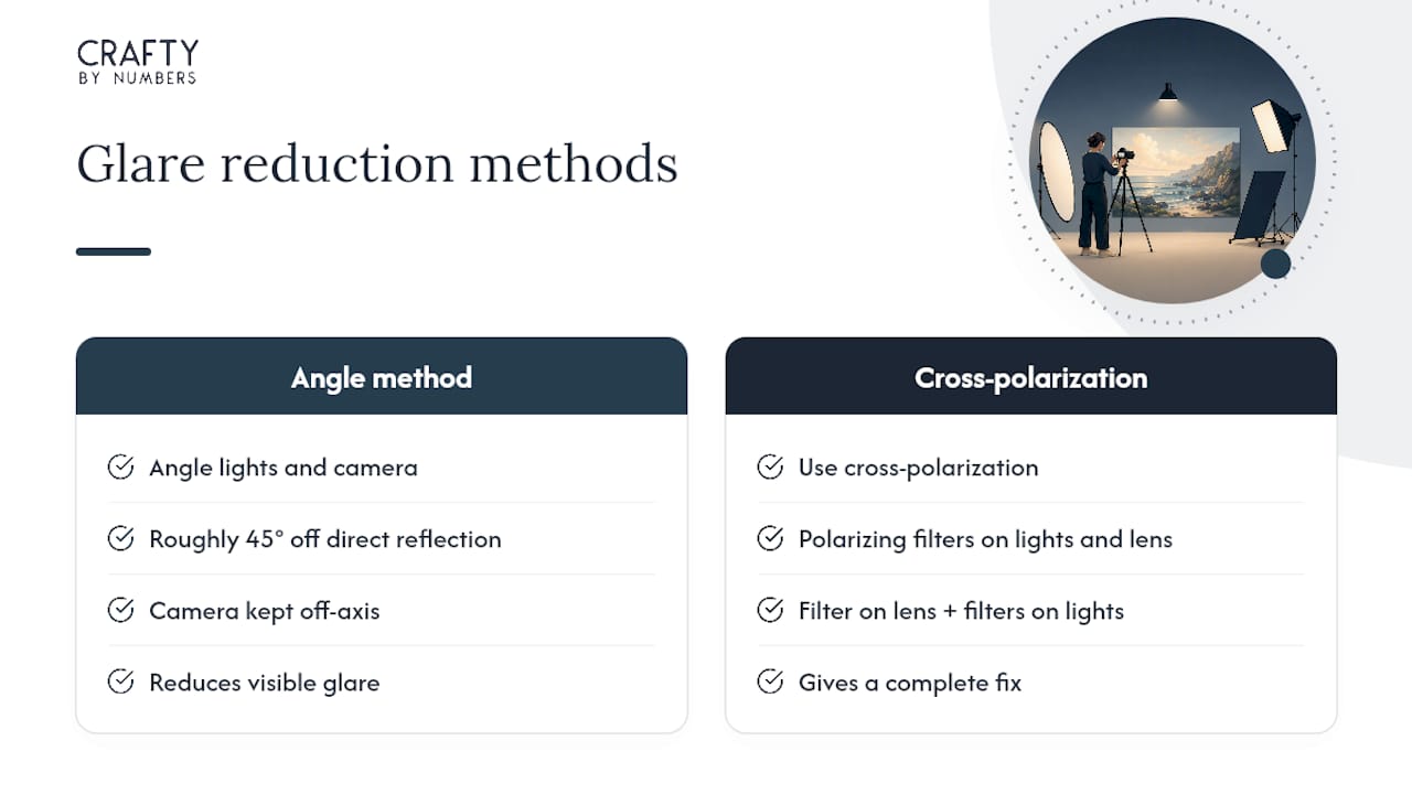
Varnished paintings and anything behind glass fight back against even the best lighting setup. The gold standard fix is cross-polarization: linear polarizers mounted on both lights, plus a matching circular polarizer on the lens, rotated until the glare disappears entirely.
Most artists don’t own polarizing gear for their lights, and that’s fine. Angling both lights and the camera away from a direct reflection path, roughly 45 degrees off-axis, cuts most glare without any special filters. If the piece is framed under glass, remove the glass for the shoot whenever you can. When you can’t, shift your camera position slightly off-center and recheck the viewfinder until the reflection clears.
For textured surfaces, add one or two raking-light detail shots, light coming in from a low angle, to show brushwork and dimension that a flat, front-on shot flattens out.
Editing for Accuracy, Not Style
Post-processing for reproduction has one job: make the file match what’s sitting on your easel, not what looks dramatic on a screen. Start from your RAW master, never a compressed export.
- Set white balance using your grey card frame as reference
- Correct exposure and any lens distortion (barrel or pincushion warping is common with wide lenses)
- Crop and straighten while comparing side by side against the actual painting under the same light you shot in
- Make small contrast and saturation adjustments only, resisting the urge to punch up colors beyond what’s真实
Once the edit is locked, export in the format that matches the destination:
- Archive master: TIFF or maximum-quality JPEG, kept untouched
- Web/social: sRGB JPEG at 72 dpi
- Print: TIFF at 300 dpi in Adobe RGB or ProPhoto RGB
Keep that high-resolution master permanently. Social platforms compress images aggressively on upload, and once that compression happens, you can’t recover the lost detail from the platform copy alone.
Naming, Backing Up, and Sharing Files Without Losing Quality
A simple naming pattern saves hours later: Title_Date_Dimensions_Medium, something like “BlueGarden_2026_24x36_oil.jpg.” Add metadata (artist name, medium, date) in your editing software if it supports embedding it directly into the file.
Store your RAW or TIFF masters in two places: a local hard drive and a cloud backup. Never let your only copy of a master file live on the same device you’re actively editing on.
- Keep web exports and archive masters in clearly separated folders
- Use a transfer service like WeTransfer when sending full-resolution files to a client or gallery, since it previews files in-browser without re-encoding or degrading them
- Save a smaller, web-ready export specifically for social platforms so you’re not uploading your master by accident
Photographing Art on Your Phone: A Fast, Reliable Shortcut
No studio, no DSLR, no problem. Shoot RAW if your phone supports it, prop it on a tripod or a stack of books, and use the built-in timer so you’re not introducing shake by tapping the screen.
Place a grey or white card in frame to set white balance, then edit with an app like Snapseed or Lightroom Mobile for brightness, color, and crop corrections. Save your high-resolution master first, then export a compressed copy for posting. A watermark in the corner protects credit if the image gets shared beyond your control. The gap between phone and DSLR results is genuinely small for flat, non-reflective work.
A Working Photographer’s Take on Getting This Right
I use this exact workflow whether I’m shooting a quick phone photo of a student’s practice piece or setting up two lights for a client commission. It scales up and down without changing the fundamentals. Keep it simple for social posts and casual sharing. Spend the money on a professional only when a print run or a gallery submission is riding on the color being exactly right.
Ready to Photograph a Finished Piece Worth Showing Off?
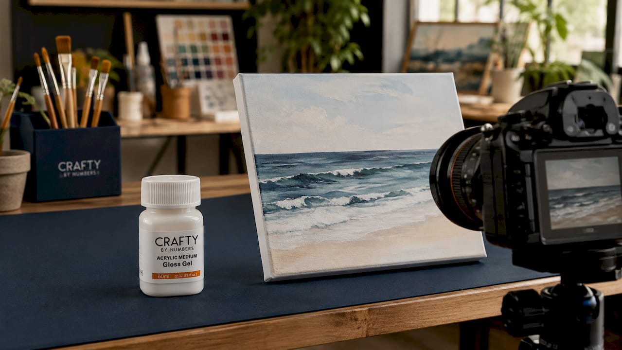
Good photography starts with a piece worth photographing, and that’s where finishing touches matter more than most artists expect. A gloss varnish or an Acrylic Medium Gloss Gel changes how light bounces off your surface, which means your lighting setup needs to account for that reflectivity before you commit to a full shoot. If you’re finishing a Crafty By Numbers kit like Ivory Essence, Garden of Dreams, or Blossoming Cottage, photograph a small test area with your Gloss Varnish applied before you varnish the whole canvas. That single test shot tells you exactly how much glare you’ll be fighting and whether you need to adjust your light angles.
A Paint Organizer Stand also keeps your workspace clear of clutter, which matters more than most people realize when you’re trying to shoot a clean, distraction-free background. Browse the full kit collection at Crafty By Numbers and pick your next project with the finished, photograph-ready result already in mind.
Tools Worth Bookmarking for Better Artwork Photos
A grey card or color checker anchors accurate white balance in every shoot. Snapseed and Lightroom Mobile handle fast, faithful mobile edits. WeTransfer moves high-fidelity files to clients without compression loss, and a photography partner guide like this one on photographing instruments offers useful cross-industry lighting tips for reflective, dimensional objects.
- Grey card / color checker for white balance
- Snapseed or Lightroom Mobile for on-the-go editing
- WeTransfer for sending uncompressed master files
Sources
- How to share files — WeTransfer resources
- How to Photograph Artwork: Step‑by‑Step Guide for Beginners — Alan Ranger
- Photographing artwork: tips — Digital Photography School
- How to Photograph and Edit Art Pictures for Social Media — All About Photo
FAQ
What Is the Best Way to Share Finished Artwork Online?
Export a web-ready sRGB JPEG from your color-corrected master, keep the original TIFF or RAW file archived separately, and use a service like WeTransfer when sending full-resolution copies to clients or galleries.
How Do You Get Rid of Glare When Photographing Varnished Art?
Angle your lights and camera roughly 45 degrees off the direct reflection path, or use cross-polarization with polarizing filters on both the lights and lens for a complete fix.
What File Format Should I Use for Print vs Social Media?
Use a 300 dpi TIFF in Adobe RGB or ProPhoto RGB for print, and a 72 dpi sRGB JPEG for web and social sharing.
Is There a Standard Rule for Composing Art Photos, Like a 70/30 or Rule of Thirds?
There’s no single universal ratio artists follow for photographing finished work. Definitions of composition “rules” vary by source, so focus instead on a full straight-on shot plus two or three detail crops that show texture and brushwork accurately.
Can I Photograph Finished Art on My Phone Instead of a Camera?
Yes. Shoot RAW if your phone supports it, stabilize it on a tripod, include a grey card for white balance, and edit with an app like Snapseed. Results hold up well for flat, non-reflective pieces.
0 comentarios