


Analogous colors are defined as a group of 2 to 5 hues sitting directly next to each other on the color wheel, sharing common undertones that create natural visual harmony. Unlike complementary pairs that create tension through contrast, these neighboring hues feel cohesive because they overlap in wavelength and pigment. Analogous schemes typically span a 60 to 90 degree arc on a standard 12-hue wheel. Beyond 90 degrees, the family resemblance fades and the palette loses its unified feel. Artists and designers rely on this principle to build compositions that feel balanced without looking flat.
What are analogous colors and why do they harmonize?
The science behind why these colors work together comes down to shared physical properties. Analogous colors share overlapping wavelengths and pigments, which means the human eye processes them as naturally related. Your brain reads that shared undertone as kinship, the same way you recognize family members by similar features.
On a standard 12-hue color wheel, a classic example of an analogous group runs from yellow through yellow-green to green. Another runs from red-orange through red to red-violet. Each color in the group carries a portion of its neighbor’s identity. Blue (0,0,255) and blue-green (0,128,128) share the blue RGB channel, which is exactly why they look like they belong together.
The result is a palette that feels calm, connected, and easy on the eye. Nature uses this constantly. Think of a forest at dusk: yellow-green leaves, deep green shadows, and blue-green water all occupy the same visual field without competing. That is the analogous principle at work in the real world.
- Yellow to orange: Warm, energetic, and sun-drenched. Common in autumn landscapes and food branding.
- Blue to violet: Cool, meditative, and atmospheric. Favored in seascape paintings and wellness design.
- Red to orange: Intense and passionate. Appears in fire imagery, fashion, and bold editorial work.
- Green to blue-green: Fresh and natural. Standard in botanical illustration and environmental campaigns.
Pro Tip: When you identify your analogous group, mark the three colors closest to the center of your arc as your primary palette. The outer two act as supporting accents, not equals.
How to pick and use analogous colors effectively
The standard approach starts with one dominant hue, then pulls one or two neighbors to support it. That dominant color should cover roughly 60 percent of your composition. The supporting hues fill the rest. This ratio creates clear hierarchy without making the palette feel random.
The risk with analogous schemes is monotony. Using more than three colors in an analogous scheme requires careful adjustment in saturation and value to avoid a flat, undifferentiated result. Beginners often apply all five hues at full saturation, which produces a muddy, uninteresting surface. The fix is to vary lightness and intensity across the group.
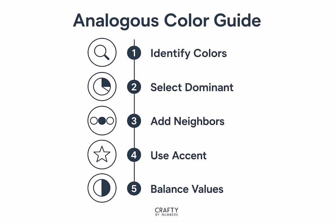
Here is a reliable process for building a working analogous palette:
- Choose your anchor hue. Pick the color that best expresses your intended mood. Warm anchor hues (red, orange, yellow) feel active. Cool anchor hues (blue, violet, green) feel restful.
- Select your neighbors. Take one or two hues directly adjacent on the wheel. Stay within a 60-degree arc for tight harmony.
- Vary the values. Push one hue lighter (a tint) and one darker (a shade). This creates depth without leaving the analogous family.
- Add a neutral anchor. White, gray, or black lets analogous colors breathe and prevents the palette from feeling claustrophobic.
- Introduce a complementary accent. Professional designers add a complementary accent color for focal points and contrast. Use it sparingly, no more than 10 percent of the composition, for highlights or key details.
The “analogous + accent” technique is one of the most versatile strategies in professional design. It gives you the calm unity of a harmonious palette while still providing the visual pop needed to direct a viewer’s eye.
Pro Tip: Decide on a temperature bias before you start. A warm-leaning analogous palette (yellow, yellow-orange, orange) reads very differently from a cool one (blue-green, blue, blue-violet). Mixing warm and cool hues within the same analogous group creates subtle tension that can feel unresolved.
Common mistakes that flatten analogous palettes
The most common mistake artists make is treating all analogous colors as equals. Applying equal intensity across every hue in the scheme produces dull results. Every color fights for attention at the same volume, and the composition loses its focal point.
A second mistake is ignoring lightness contrast. Saturation alone does not create depth. You need a range from light to dark within your palette. Without that range, the eye has nowhere to rest and nowhere to travel.
Watch for these specific errors in your work:
- Flat saturation across all hues. Every color at 100 percent saturation creates visual noise. Drop two of your five hues to 50–70 percent saturation to create breathing room.
- No dominant color. When every hue takes equal space, the composition feels indecisive. Assign one hue the lead role.
- Skipping the neutral. Removing white, gray, or black from an analogous palette removes the visual rest points. Neutrals are not boring. They are structural.
- Overextending the arc. Stretching beyond 90 degrees on the wheel pulls in colors that no longer share enough common pigment. The palette starts to feel like two separate schemes fighting each other.
- Misplacing the accent. A complementary accent placed in the background competes with the focal point. Reserve it for the single most important element in the composition.
Effective analogous palettes balance unity with enough variety to hold a viewer’s attention. The goal is harmony, not uniformity. Those are two different things.
Practical exercises for mastering analogous color blending
Hands-on practice is the fastest way to internalize how these palettes behave. A 2-day watercolor project using masking tape and wet-on-wet techniques is one of the most effective classroom methods for learning analogous transitions. Students tape off geometric shapes on watercolor paper, then blend neighboring hues wet-on-wet to observe how the colors merge and transition naturally.
The wet-on-wet method works because it forces the colors to interact on the paper rather than in your head. You see exactly where one hue ends and the next begins, and you learn to control that boundary through water ratio and timing.
For graphic designers and digital artists, the same principle applies through software color pickers and interactive color wheels. The exercise is identical: choose an anchor hue, select its neighbors, then test the palette against both light and dark backgrounds.
| Exercise | Medium | Skill developed |
|---|---|---|
| Wet-on-wet geometric shapes | Watercolor | Smooth color transitions |
| Tint and shade gradient strips | Acrylic or gouache | Value range within a hue |
| Analogous + accent composition | Any medium | Focal point placement |
| Digital palette testing | Design software | Readability and contrast |
For beginner art projects, starting with a three-color analogous palette on a simple subject (a single flower, a landscape horizon) removes complexity and lets you focus entirely on color relationships. Add the fourth and fifth hues only after you can control the first three with confidence.
Managing analogous schemes by temperature rather than just wheel position gives you better emotional control over the finished work. A palette of yellow-green, green, and blue-green reads as cool and natural. Shift the same arc one step warmer to yellow, yellow-green, and green, and the mood lifts noticeably.
Key takeaways
Analogous colors work because shared wavelengths create natural harmony, but controlling value, saturation, and temperature is what separates a flat palette from a compelling one.
| Point | Details |
|---|---|
| Definition of analogous colors | Groups of 2–5 adjacent hues on the color wheel within a 60–90 degree arc. |
| Why they harmonize | Shared wavelengths and pigments reduce visual tension and signal kinship to the brain. |
| Avoid equal intensity | Vary saturation and value across the palette to create depth and hierarchy. |
| Use the analogous + accent method | Add one complementary accent color sparingly to create focal contrast without breaking harmony. |
| Neutral anchors matter | White, gray, or black gives the palette breathing room and improves compositional balance. |
Why I think most artists underuse the analogous palette’s full range
Paula S. here. After years of working with color theory in both painting and design, the pattern I see most often is this: artists discover analogous schemes, love the harmony, and then stop there. They pick three adjacent hues, apply them at similar intensities, and wonder why the result feels safe but lifeless.
The real power of an analogous palette comes from treating it as a tonal family, not a flat set of colors. When I work with a blue-to-violet range, I am not just using three hues. I am using a light blue-violet, a mid-tone blue, a deep violet, a near-white tint, and a near-black shade. That is five or six distinct values from three hues. The palette feels rich because of the range, not because of the number of colors.
The other shift that changed how I work was thinking in temperature first. Before I touch the wheel, I ask: does this piece need to feel warm or cool? That single decision narrows my arc immediately and gives the whole composition an emotional direction. A family painting night using warm analogous colors (red, orange, yellow-orange) produces a completely different emotional result than the same activity with a cool palette. Neither is wrong. Both are intentional.
The accent color is where most artists hesitate. Adding a complementary pop to a harmonious palette feels risky. My advice: place it last, place it small, and place it on your most important element. It will do exactly what you need without breaking the mood you built.
— Paula S.
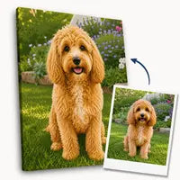
Craftybynumbers kits that put analogous color theory into practice
Color theory becomes real the moment you apply it to an actual canvas. Craftybynumbers designs its paint-by-numbers kits with carefully curated palettes that reflect real color harmony principles, making them ideal for practicing what you have learned here.

The Ivory Essence kit features a soft, warm analogous palette that demonstrates how tints and near-neutrals create elegance without contrast. The Garden of Dreams kit uses a green-to-blue-green range that shows exactly how a cool analogous scheme builds atmosphere in a natural scene. Each kit includes a pre-printed canvas, high-quality acrylic paints, and detail brushes, so you can focus on color relationships rather than setup. Craftybynumbers has served over 120,000 customers and offers personalizable options for artists who want to work with specific palettes.
FAQ
What is the definition of analogous colors in art?
Analogous colors are groups of 2 to 5 hues that sit directly next to each other on the color wheel, typically within a 60 to 90 degree arc. They share common undertones, which creates natural visual harmony in paintings and designs.
How many colors make up an analogous scheme?
A standard analogous scheme uses 3 colors within a 60-degree arc for the tightest harmony. Schemes of 4 or 5 colors are effective but require careful variation in saturation and value to avoid monotony.
What is a good example of analogous colors?
Yellow, yellow-green, and green form a classic analogous group. Red, red-orange, and orange are another common example, frequently used in warm, energetic compositions.
How do you add contrast to an analogous palette without breaking harmony?
The “analogous + accent” technique adds one complementary color in small amounts, no more than 10 percent of the composition, to create a focal point. This preserves the palette’s unity while giving the eye a clear place to land.
What is the biggest mistake artists make with analogous color schemes?
Applying all hues at equal saturation and value is the most common error. Varying lightness and intensity across the palette creates depth, hierarchy, and visual interest within the harmonious scheme.
0 comentarios