

Canvas art is defined as a design element that anchors room decor by adding color, texture, scale, and a clear focal point to any interior space. Unlike framed prints behind glass, canvas brings physical depth to a wall and works with your furniture rather than competing against it. When chosen well, a single canvas can unify an entire room’s color palette, establish its emotional tone, and make the space feel finished. This guide covers the size rules, color principles, placement standards, and material advantages that make canvas wall art one of the most effective tools for enhancing interiors.
How canvas art complements room decor through size and scale
The most common mistake homeowners make is choosing a canvas that is too small. A piece that looks bold in a store can disappear on a large wall, creating what designers call the “postage stamp” effect.
The industry standard for sizing canvas art is the two-thirds rule. Canvas width should span roughly two-thirds of the furniture below it. For a standard 84-inch sofa, that means a canvas between 56 and 63 inches wide. This proportion creates visual balance without overwhelming the room.
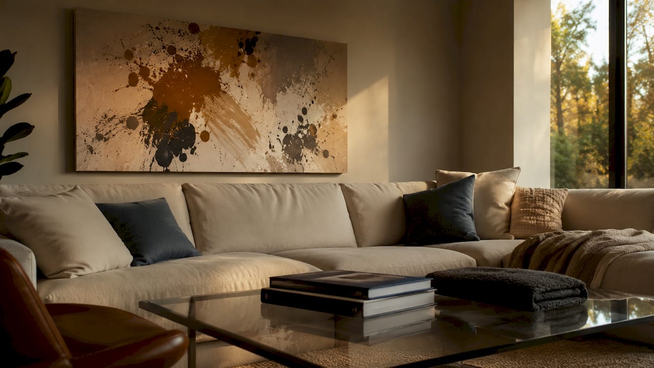
For large walls with no furniture anchor, sizes in the 40x30 to 60x40 inch range work best. The 60x40 inch canvas is the most popular choice for large walls in 2026. That popularity reflects a broader shift toward bolder, more confident art choices in residential interiors.
When you are deciding between two sizes, always go larger. Oversized pieces create bold, intentional statements and proportionate balance. A canvas that fills its wall space reads as deliberate. One that leaves too much empty space around it reads as an afterthought.
Pro Tip: Tape newspaper cutouts to your wall before buying. This professional visualization method lets you confirm the size will look proportionate before you spend a dollar.
| Canvas size | Best placement |
|---|---|
| 8x10 to 16x20 inches | Gallery walls, small accent walls, bathrooms |
| 20x24 to 30x20 inches | Bedroom nightstand walls, office accent walls |
| 36x24 to 48x36 inches | Above a sofa, dining room focal wall |
| 60x40 inches | Large living room walls, entryways, above a king bed |
| Multi-panel sets | Wide walls where a single canvas would feel narrow |
How does color theory help canvas art harmonize with your room?
Matching your canvas to your wall color is the most common color mistake in home decor. It produces a flat, catalog-like appearance where the art disappears into the background. The color wheel gives you a better framework.
Using the color wheel is more effective for coordinating art and decor than directly matching wall colors. Three approaches work consistently well:
- Complementary colors sit opposite each other on the wheel (blue and orange, red and green). They generate visual energy and contrast, making a room feel alive and dynamic.
- Analogous colors sit next to each other (blue, blue-green, green). They create a calm, cohesive feel that works well in bedrooms and reading rooms.
- Monochromatic schemes use different shades of one color. They add depth and sophistication without visual clutter, ideal for minimalist or contemporary spaces.
The practical application is straightforward. If your living room has warm gray walls and a tan sofa, a canvas with deep teal and rust tones introduces complementary contrast. The room gains energy without feeling chaotic. For a bedroom with soft sage walls, a canvas in dusty blue and warm cream creates an analogous palette that feels restful.
Repeating key hues from canvas art throughout the room using smaller accessories creates a cohesive, professionally curated look. Pull one color from the canvas and repeat it in a throw pillow, a vase, or a rug. That repetition ties the art to the room without making the space feel over-coordinated.
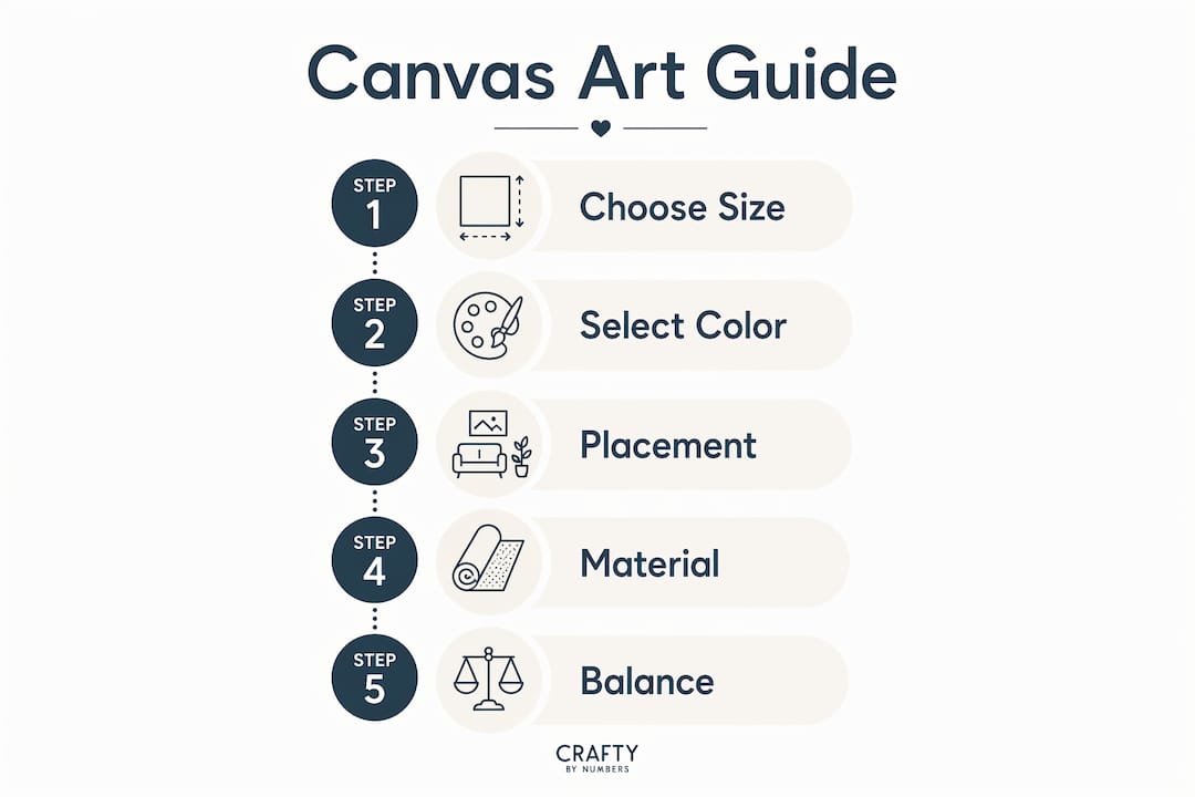
Pro Tip: Learn color theory basics before you shop. Knowing the difference between analogous and complementary schemes takes 10 minutes to learn and saves you from expensive mistakes.
Best canvas art placement strategies for visual balance
Placement determines whether canvas art feels intentional or accidental. The standard professional guideline is to hang the canvas center at 57 to 60 inches from the floor. This eye-level placement creates comfortable visual focus and prevents the detached look that comes from hanging art too high.
Follow these placement steps for any room:
- Measure the wall and furniture. Note the width of your sofa, bed, or console table before choosing canvas size or position.
- Find the visual center of the furniture. Align the horizontal center of the canvas with the center of the furniture below it. This creates a visual anchor.
- Mark 57 to 60 inches from the floor. This is where the center of your canvas should land. Adjust slightly in rooms with very high or low ceilings.
- Layer with other decor. Place a floor lamp, a plant, or a mirror beside the canvas to create depth. Canvas art works best as part of a layered arrangement, not as a lone element on a bare wall.
- Check the lighting. Natural light from a window beside the canvas will highlight its texture. Overhead lighting works well with canvas because the surface absorbs rather than reflects light.
Room-specific guidance matters too. In a living room, center the canvas above the sofa and keep it within the furniture grouping. In a bedroom, hang art above the headboard so the bottom edge sits 6 to 8 inches above the top of the headboard. In an entryway, a single large canvas at eye level creates an immediate impression. In a home office, art placed at seated eye level reduces visual fatigue during long work sessions.
For inspiration on pairing canvas art with specific furniture arrangements, the principles of scale and alignment apply across every room type.
Why canvas material gives it an advantage in room design
Canvas is not just a surface. It is a material with specific physical properties that make it better suited to most rooms than glass-framed prints.
The key advantages of canvas in room design include:
- Texture adds depth. The woven surface of canvas creates subtle shadow and dimension that flat prints cannot replicate. This physical depth makes a room feel layered and finished.
- No glare. Canvas absorbs ambient light rather than reflecting it. Glass-framed art produces glare in well-lit rooms, which distracts from the image and creates viewing discomfort. Canvas eliminates that problem entirely.
- Long-lasting color. Archival pigment inks provide decorative longevity of over 75 years. That means the colors you choose today will still look accurate decades from now.
- Texture complements furniture. Canvas pairs naturally with velvet upholstery, wood furniture, and woven textiles. The material speaks the same visual language as organic, tactile decor.
Canvas is particularly well-suited to rooms with large windows or strong overhead lighting. In those spaces, glass-framed art becomes a mirror at certain angles. Canvas stays clear and readable from every position in the room.
Practical tips for integrating canvas art into any room style
Canvas art establishes a room’s mood more than any other decor element. That means your art choice is not just decorative. It is a decision about how the room feels to everyone who enters it.
- Choose art that responds to texture, not just color. A room with leather furniture and dark wood calls for art with bold, graphic lines. A room with linen sofas and rattan accents suits softer, organic imagery.
- Use a statement piece before building a gallery wall. Start with one large canvas to establish the room’s direction. Add smaller pieces around it only after the primary piece feels right.
- For rental spaces, use adhesive hanging strips rated for canvas weight. Most canvas prints are lightweight enough for damage-free hanging solutions. You can create a fully styled space without drilling a single hole.
- Avoid overly literal matching. A beach-themed room does not need a canvas of waves. A canvas with the blues, sandy tones, and warm whites of a coastal palette achieves the same mood with more sophistication.
- Multi-panel canvas sets work well on wide walls where a single piece would need to be very large. Three panels of equal size create rhythm and fill horizontal space naturally.
For rooms designed around cultural identity and personal meaning, intentional art choices create emotional resonance that generic decor cannot replicate. Art that reflects who you are makes a room feel genuinely yours.
Pro Tip: If your room feels disconnected, look at your canvas first. Large canvas paintings often solve the “something is missing” problem by giving the eye a clear place to land.
Key Takeaways
Canvas art complements room decor most effectively when size, color, placement, and material properties work together to anchor furniture and define the room’s emotional tone.
| Point | Details |
|---|---|
| Follow the two-thirds rule | Canvas width should cover roughly two-thirds of the furniture below it for visual balance. |
| Use the color wheel, not wall matching | Complementary or analogous color schemes create dynamic, cohesive rooms better than direct color matching. |
| Hang at 57–60 inches from the floor | This eye-level standard keeps art visually connected to the room and comfortable to view. |
| Choose canvas for its material benefits | The non-reflective surface and archival inks make canvas more durable and glare-free than glass-framed prints. |
| Go larger when in doubt | Oversized canvas art reads as intentional; undersized art reads as an afterthought. |
Why I think most people underestimate canvas art’s power
After years of observing how rooms change with and without strong wall art, I am convinced that canvas is the single most underused tool in home decor. People spend thousands on furniture and then hang a canvas that is half the size it should be, in a color that disappears into the wall.
The shift I have seen in premium interiors over the past few years is clear. Oversized canvas art in natural, textured palettes is replacing the small, framed print clusters that dominated a decade ago. The rooms that feel most resolved are the ones where the art was chosen first, not last.
My honest advice: treat the canvas as the starting point, not the finishing touch. Pick the art that genuinely moves you, then build the room’s color palette and furniture arrangement around it. That approach produces rooms that feel personal and complete, not assembled from a checklist.
The other thing I have learned is that canvas art you painted yourself carries a different weight entirely. There is something about a piece you created that makes a room feel unmistakably yours. It is not just decor. It is a record of time you spent making something.
— Paula S.
Canvas art collections worth adding to your walls
Craftybynumbers offers paint-by-numbers kits that produce gallery-quality canvas art you paint yourself, using pre-printed canvases, high-quality acrylic paints, and detail brushes.

The Ivory Essence collection suits rooms with neutral palettes and textured furniture, delivering sophisticated tones that work with the color principles covered here. For rooms that need vibrant, calming color, the Garden of Dreams prints bring layered hues that complement both contemporary and traditional interiors. Each finished piece is designed to be displayed proudly, with archival-quality results that hold their color for decades. With over 120,000 satisfied customers, Craftybynumbers turns the process of creating wall art into a rewarding experience that ends with something genuinely worth hanging.
FAQ
What is the two-thirds rule for canvas art?
The two-thirds rule states that canvas width should cover approximately two-thirds of the furniture below it. For an 84-inch sofa, that means a canvas between 56 and 63 inches wide.
How high should I hang canvas art on the wall?
Hang the center of your canvas at 57 to 60 inches from the floor. This eye-level standard keeps the art visually connected to the room and prevents it from looking too high or too low.
Should canvas art match my wall color?
No. Matching canvas art directly to wall color produces a flat, uninspired look. Use complementary or analogous color schemes from the color wheel to create visual depth and energy instead.
Why is canvas better than glass-framed prints for most rooms?
Canvas absorbs light rather than reflecting it, eliminating glare in well-lit rooms. Archival pigment inks also give canvas prints a decorative lifespan of over 75 years, making them a longer-lasting choice.
Can renters hang canvas art without damaging walls?
Yes. Most canvas prints are light enough for adhesive hanging strips rated for their weight. This lets renters create a fully styled space without drilling holes or risking their security deposit.
0 comments